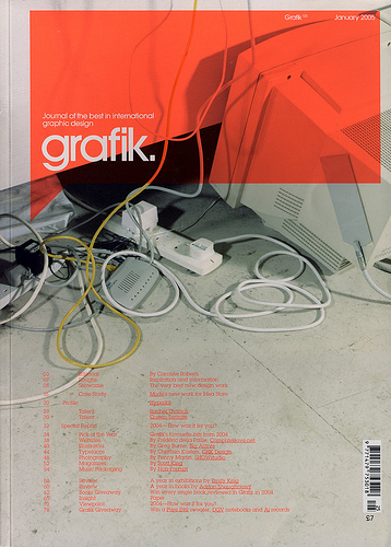
i like the way a neon and grey palette can be soft and subtle even if the thought of it is harsh. its strange to think of all the colours that fit in between fluoro and grey grafik jan05...jil sander 08 / agnes martin
i had this idea...(no i did!) its sketched out in a sketchbook...(very vaguely) anyway whats an idea. not very interesting. this is
needless to say i think this is pretty great. basically its looking at blogging / internet content in print format. and what better medium than as a newspaper? restrained, templated design, fast paced, and so un-precious. i love that the designer has kept the integrity of classic newspaper design elements, but also given it its own identity with some subtle and lovely typographic and space variations. i also like that content wise its a complete spin on the default online/print relationship.


 why i love you too!


 Adrian Frutiger - Typefaces. The Complete Works

 Posts
Posts